NEO Bank – Mobile Banking App

Home > Parent Category > Category > Page Title NEO Bank – Mobile Banking App Designing A Secure And User Friendly Digital Banking Solution A modern finance app built with intuitive navigation, personalized dashboards, real-time transaction updates, and strong security empowering users with seamless, stress-free banking anytime, anywhere. Client The Morning Ritual Industry Cafre & Hospitality Category Branding Location Pune Project Brief This project involved designing a secure, user-friendly mobile banking app with intuitive dashboards, real-time updates, budgeting tools, and multilingual accessibility. The focus was on simplifying navigation, strengthening trust with clear security, and ensuring a seamless,stress-free banking experience for all users. The Challenge The client envisioned blending luxury with eco-consciousness through brand identity and website design. They required logo, typography, colors, iconography, and a homepage featuring hero messaging, products, ingredients, rituals, sustainability, and consistent design guidelines. Our Approach Research Surveyed users across cities to identify stress points like clutter, accessibility gaps, and vague security signals. Strategy Mapped user personas and crafted a visual hierarchy to streamline navigation and build trust. Execution Delivered 50+ polished screens with AI-assist, multilingual support, investment learning, and accessible flows. Problem Users face issues like confusing navigation, delayed transaction updates, and lack of personalization, making the app hard to use. Poor accessibility for visually impaired and non-native speakers adds to the problem. Low engagement with tools and unclear communication further reduce trust, worsened by weak in-app support and vague security messaging. Solution We aim to design a new banking app that is intuitive, secure, and accessible for all users. The app will feature a clean, user-friendly interface with personalized dashboards, real-time transaction updates, and smart financial tools like budgeting and spending insights. The app will support multiple languages and work well with screen readers. Strong security features and clear messaging will build trust, while in-app chat and guided onboarding will ensure smooth user support and engagement. Logo Design Visual design focuses on aesthetics color, layout, and imagery. It enhances usability, builds trust, and creates emotional connection, making the experience more engaging, appealing, and memorable for users. 01 Color palette 02 03 Typography Low- Fidelity prototype I turn ideas into detailed visuals. Using the wireframes from the ideate stage, we create high-fidelity screens with a clean, user-friendly interface. I focus on layout, colors, typography, icons, and consistency to ensure the app is easy to use and visually appealing. I also make sure the app is accessible, responsive, and ready for prototyping and testing. 04 05 Ui Design screen Conclusion The existing app faced challenges such as complex navigation, cluttered dashboards, slow performance, poor accessibility, and low trust due to unclear security communication. These issues made everyday banking tasks difficult and time-consuming Let's craft what's next
Aroma Box

Home > Parent Category > Category > Page Title Aroma box A Mobile-First Food Platform for Healthy Jain Meal Scheduling A gardening app brand identity crafted to reflect simplicity, sustainability, and community connection through clean, intuitive, and nature inspired design. Client The Morning Ritual Industry Cafre & Hospitality Category Branding Location Pune Project Brief: Design a mobile-first food ordering experience focused on homestyle Jain meals, simplifying daily ordering through clarity, personalization, and scheduling. The Challenge: Balancing rich food content and dietary needs while keeping the experience fast, simple, and trustworthy for everyday use. Our Approach: A user-first, mobile-first design using early personalization, clear navigation, and trust-driven UI to support daily meal routines. Problem Users following Jain and homestyle diets struggle to find simple, trustworthy food apps for daily meals. Existing platforms are cluttered, fast-food focused, and not designed for routine meal planning Solution AromaBox offers a personalized, mobile-first experience with preference-based onboarding, clear meal discovery, advanced dietary filters, and meal scheduling—making everyday food ordering effortless and reliable. Low-Fidelity Wireframes: The process started with low-fidelity wireframes to map core user flows, content hierarchy, and navigation without visual distractions. Let's craft what's next
Dr Pat’s – Skincare

Home > Parent Category > Category > Page Title Dr. Pat’s – Skincare Designing a Pure, Nature- Inspired Brand Identity. Crafting minimal, sustainable design across logo, packaging, and visuals to reflect purity, trust, and the holistic essence of natural skincare. Client The Morning Ritual Industry Cafre & Hospitality Category Branding Location Pune Project Brief Dr. Pat’s needed a clean, earthy visual identity to reflect their commitment to natural skincare. They wanted a premium design language for their logo, packaging, and digital presence that would communicate purity, quiet luxury, and sustainability.. The Challenge Dr. Pat’s lacked a cohesive design system. The brand needed to speak to eco-conscious buyers with a modern, nature-rooted identity across touchpoints.. Our Approach Research Studied pet parent engagement trends and interactive content types that encourage sharing. Strategy Framed content around games (like quizzes and housie) to make healthcare fun without losing credibility. Execution Designed modular, branded templates that balance pet love with product awareness and trust. Problem The brand needed a clear, cohesive identity that expressed its natural skincare philosophy while standing out across logo, packaging, and visual communication. Solution We created a minimal, nature-inspired identity system with a refined logo, sustainable packaging design, and consistent visuals that reflect purity, authenticity, and eco-conscious values. Visual Design Visual design focuses on aesthetics color, layout, and imagery. It enhances usability, builds trust, and creates emotional connection, making the experience more engaging, appealing, and memorable for users. Conclusion The project successfully transformed Dr. Pat’s into a cohesive, premium skincare brand with a nature-inspired identity, strengthening trust, clarity, and connection with eco-conscious consumers across all touchpoints. Let's craft what's next
Virbac – Pet Healthcare

Home > Parent Category > Category > Page Title Virbac – Pet Healthcare Designing Engaging Instagram Campaigns for Pet Parents Creating fun, interactive social content that simplifies pet healthcare and builds stronger emotional connections between Virbac and pet owners. Client The Morning Ritual Industry Cafre & Hospitality Category Branding Location Pune Project Brief Virbac asked to design social campaigns that could simplify pet healthcare without losing credibility. They wanted fun, educational formats for Instagram that pet owners could relate to, while staying aligned with their expert medical tone. The Challenge Pet owners often ignored health-related content due to complexlanguage and sterile tone. Virbac needed to humanize healthcarethrough content. Our Approach Research Studied pet parent engagement trends and interactive content types that encourage sharing. Strategy Framed content around games (like quizzes and housie) to make healthcare fun without losing credibility. Execution Designed modular, branded templates that balance pet love with product awareness and trust. Problem Virbac, a leading pet healthcare brand, needed to create stronger engagement with pet parents online. Their challenge was to simplify healthcare awareness while making their digital presence feel more personal, approachable, and interactive. Solution We designed an engaging, user-friendly digital experience that simplifies pet healthcare informationthrough clear content, interactive features, and warm visuals, helping Virbac connect more personally with pet parents while building trust and awareness. Outcome Virbac’s campaigns saw higher participation and brand warmth. Engagement rose, and pet owners began seeing the brand as both informative and approachable. Let's craft what's next
Rootly

Home > Parent Category > Category > Page Title Rootly- The Gardening App Building Gardening App Identity to Digital Experience Design. A gardening app brand identity crafted to reflect simplicity, sustainability, and community connection through clean, intuitive, and nature inspired design. Client The Morning Ritual Industry Cafre & Hospitality Category Branding Location Pune Project Brief Neeroop Organic sought a brand and website that conveyed modern luxury and sustainability. The challenge was to balance indulgence with trust and create a digital flow that tells ingredient stories, rituals, and values with clarity and grace. The Challenge In a crowded skincare market, luxury brands often feel generic.Neeroop needed to stand out with authenticity, credibility, and strong storytelling. Rituals, sustainability, and consistent design guidelines. Our Approach Research Aligns with Neeroop’s focus on clean beauty, ingredient transparency, rituals, and sustainability. Strategy Reflects the brand goal of modern luxury + purity + trust through minimal, calm, nature-led design. Execution Connects directly to your delivered outcomes: brand system, UI design, storytelling website, products, rituals, sustainability, and community. Urban home gardeners, especially busy working individuals, often struggle to maintain healthy plants due to limited time, lack of expert guidance, and difficulty accessing the right tools or fertilizers. Without proper care routines, pest control knowledge, and organized garden management, plants fail to leading to frustration and reduced motivation. I delivered a clean, nature-inspired brand identity and intuitive UI design for the gardening app. Beyond the brief, I introduced photo-clicking for plant identification and a community feature, making the experience engaging, educational, and eco-conscious. Visual Design Low-fi to UI design Wireframes are simple, low-fidelity sketches or layouts used in design to show the basic structure of a screen or page without any colors, images, or detailed visuals. Let's craft what's next
Neeroop Organic

Home > Parent Category > Category > Page Title Neeroop Organic Building Luxury Skincare Brand Identity to Website Design A gardening app brand identity crafted to reflect simplicity, sustainability, and community connection through clean, intuitive, and nature inspired design. Client The Morning Ritual Industry Cafre & Hospitality Category Branding Location Pune Project Brief Neeroop Organic sought a brand and website that conveyed modern luxury and sustainability. The challenge was to balance indulgence with trust and create a digital flow that tells ingredient stories, rituals, and values with clarity and grace. The Challenge In a crowded skincare market, luxury brands often feel generic.Neeroop needed to stand out with authenticity, credibility, and strong storytelling. Rituals, sustainability, and consistent design guidelines. Our Approach Research Aligns with Neeroop’s focus on clean beauty, ingredient transparency, rituals, and sustainability. Strategy Reflects the brand goal of modern luxury + purity + trust through minimal, calm, nature-led design. Execution Connects directly to your delivered outcomes: brand system, UI design, storytelling website, products, rituals, sustainability, and community. Neeroop Organic, a skincare brand, needed a strong identity and digital presence reflecting purity, elegance, and eco-conscious values while ensuring consistency across logo, packaging, and website with engaging, user-friendly storytelling. We delivered a complete design system with clean typography, muted nature inspired colors, minimal icons, and structured grids. The website evolved from wireframes to polished UI featuring hero messaging, products, rituals, sustainability, storytelling, and community-building elements. Low-fi to UI design From rough sketches to polished prototypes, moving from low-fidelity to high-fidelity ensures clarity, usability, and a seamless user experience. A wireframe is a basic visual layout of a screen that shows structure, content placement, and user flow before adding colors, images, or detailed design. Key Points Clear navigation bar with logo & menu Hero section with headline + CTA buttons Structured hierarchy with sections (products → ingredients → rituals) Minimal, grayscale placeholders (no distractions) Focus on usability, flow, and content order Conclusion The Neeroop Organic project successfully unified brand identity and digital design into a seamless system that reflects purity, sustainability, and elegance. By combining clean typography, muted organic tones, and storytelling-driven UI, created a premium yet eco-conscious experience that communicates authenticity, builds trust, and positions Neeroop Organic as a modern luxury skincare brand. Let's craft what's next
The Morning Ritual
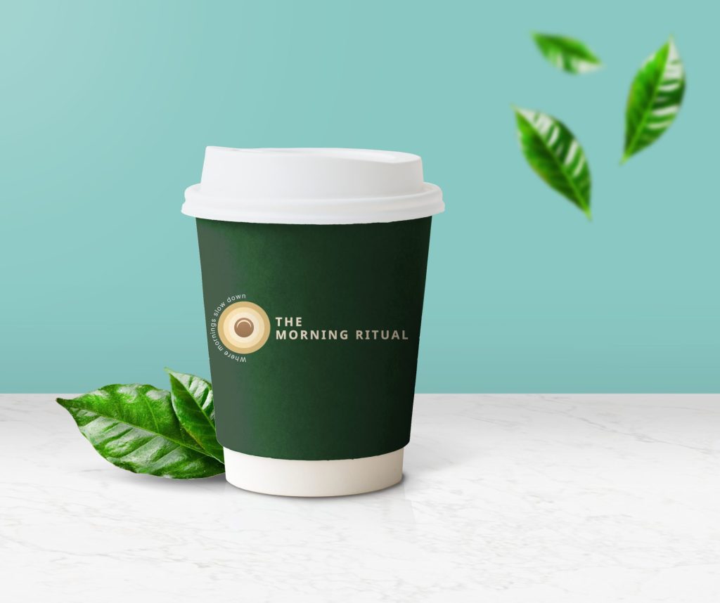
Home > Parent Category > Category > Page Title The Morning Ritual – Café & Hospitality Designing a warm cafe identity inspired by rituals and community. Creating a brand that blends artisanal coffee culture with the calm ritual of mornings, through elegant design, cohesive branding, and engaging digital presence. Client The Morning Ritual Industry Cafre & Hospitality Category Branding Location Pune Project Brief The Morning Ritual café wanted a brand that reflected the mindfulness of early mornings while standing apart from typical coffee chains. Their goal was to build a calm and artisanal identity rooted in ritual and belonging across physical and digital touchpoints. The Challenge Most cafés relied on aesthetic alone. The Morning Ritual needed to express emotional warmth, ritual, and consistency without losing brand distinction. Our Approach Research Analysed artisanal café patterns and consumer rituals around mornings to extract emotional anchors like warmth, calm, and habit. Strategy Built a narrative around ‘morning as ritual’ using soft symbolism (rising sun), earthy tones, and physical consistency. Execution Created a full brand kit: logo, packaging, loyalty touchpoints, and social media tools all rooted in a consistent mood and tone. The Outcome The café became an emotional brand. From store signage to stories online, every interaction feels intentional, drawing in a loyal, mindful community. Enhanced walk-in attraction through bold café signage Cohesive branding across digital and physical touchpoints A strong community-driven identity that connects emotionally with customers The applications extended across multiple brand touchpoints, including packaging with custom-branded coffee cups, sleeves, and takeaway bags, as well as collateral such as café standees, menu boards, and loyalty cards. On social media, we designed aesthetic grid layouts that combined storytelling with promotional offers, creating a cohesive and engaging brand experience both online and offline.
Why Design is Not Enough: The Power of Craft + Strategy

Home > Blog > Parent Category > Category > Page Title Why Design is Not Enough: The Power of Craft + Strategy Beautiful design alone doesn’t guarantee success.We’ve seen many products fail. Not because they looked bad, but because design alone couldn’t solve deeper business problems.At Hashtag Designs, we often meet teams that pour months into creating stunning interfaces. The visuals shine, the animations glide, but users still drop off. Why? Because no one stopped to ask why people would care, how they would use it, and what problem it truly solves. Craft vs. Strategy Craft is what you see: colours, fonts, motion, layouts, and micro-interactions. Strategy is what makes it work: research, user journeys, and alignment with business goals.A fintech app can look sleek, but if the onboarding process is confusing, users will quit halfway. The result? Lost customers and lost revenue.Take NEO Bank, for example. When they came to us, their app looked great, but users didn’t trust it enough to complete sign-ups. Through user research, we discovered gaps in clarity and comfort. We redesigned the visual hierarchy, simplified flows, and made the experience multilingual and accessible.The result? A smoother, more confident onboarding that drove higher adoption.Design made it beautiful.Strategy made it work. How Strategy Enhances Design Good design starts with empathy; understanding what frustrates users, what makes them hesitate, and what earns their trust.In the Rootly app, users loved the idea of plant care, but they often dropped off because instructions were confusing. Instead of just redesigning screens, we looked at the bigger picture: How could we make the app feel trustworthy, simple, and expert-led? By combining user research with a clear communication strategy, we introduced expert consultations, simpler instructions, and visual cues that built confidence. Engagement and repeat usage grew significantly. Not because of prettier visuals, but because of clearer intent.. Keep Measuring and Improving When design and strategy work together, results show up in numbers, not just appreciation posts. At Hashtag Designs, we’ve seen this across industries: Fintech (NEO Bank): Task completion up by 28%, retention up by 41%. EdTech (Rootly): Repeat usage and engagement rose after simplifying key flows.Consumer Brand (Virbac): Consistent UX led to stronger loyalty and higher participation. These outcomes prove one thing, design alone may attract users, but strategy keeps them.. The Bottom Line Design is essential, but it’s not enough. A product that looks good but doesn’t work well for users won’t last. When craft meets strategy, products become powerful, visually appealing, easy to use, and aligned with business goals. That’s how teams create experiences that not only delight users but also drive real growth. Recommended for You Here are some similar recommendations that could pique your interest. One How to Think About Scaling Your Brand From Day One The Hidden Cost of Ignoring Brand Strategy Why Design is Not Enough: The Power of Craft + Strategy
The Hidden Cost of Ignoring Brand Strategy

Home > Blog > Parent Category > Category > Page Title The Hidden Cost of Ignoring Brand Strategy When customers stop engaging or your campaigns don’t perform, it’s not always the product. Sometimes, it’s the brand story. Without a clear brand strategy, even great ideas lose attention, trust, and long-term growth potential. At Hashtag Designs, we’ve seen what happens when strategy is treated as an afterthought, and how things transform when it’s done right. Brand strategy isn’t just about logos or taglines. It’s about creating consistency, clarity, and connection across every touchpoint. The Real Costs You Can Measure Ignoring brand strategy directly hits your numbers: lower conversions, higher drop-offs, confused users, and lost revenue. Take Virbac, for example. Their social campaigns were packed with technical information, but they weren’t connecting emotionally. Pet owners didn’t feel seen, they felt sold to. A very common consumer problem…By simplifying the message and focusing on the human side of pet care, we made their communication warmer andmore relatable. Engagement and loyalty improved almost instantly. Many D2C and consumer brands face the same issue: the visuals are great, but the story isn’t aligned. When users don’t understand or trust what you stand for, they walk away, and that’s real money lost. The Hidden Inefficiencies Inside Teams Lack of strategy doesn’t just hurt externally; it slows your team down internally.Without a unified brand system, teams end up creating multiple versions of the same thing: different tones, mismatched designs, conflicting campaigns. Sounds relatable, right?When Dr. Pat’s Skincare came to us, they had exactly this problem. Packaging, website, and social media all looked like different brands.We helped them define a clear, nature-inspired, minimalist system that worked everywhere – digital, print, and retail.The result? Faster decisions, smoother workflows, and a brand that finally felt like one.For SaaS and B2B brands, this problem often shows up as onboarding confusion, repeated customer queries, and low adoption. All because there’s no consistent story tying the experience together. The Opportunities You Miss The biggest cost of ignoring strategy isn’t what you lose today, it’s what you never get to build tomorrow. Brands with strong strategy grow faster because every decision supports a clear direction. Take Rootly, again. By embedding transparency and credibility into their product and messaging, they built stronger trust, and with it, long-term engagement.For fintech, EdTech, and consumer brands, that’s the edge: strategy keeps your message clear as you expand and your audience grows.Every missed opportunity, every confused user & every inconsistent campaign, there is a chance that could have become growth. The Takeaway Ignoring brand strategy doesn’t just affect how you look, it affects how you grow. It costs you customers, efficiency, and future opportunities (crying in the corner).When design, UX, and messaging align under a clear strategy, brands don’t just look good, they perform better, scale faster, and earn trust that lasts. Don’t leave growth to chance.Build a strategy that turns your brand into a business advantage and Hashtag Designs is happy to help! Recommended for You Here are some similar recommendations that could pique your interest. One How to Think About Scaling Your Brand From Day One The Hidden Cost of Ignoring Brand Strategy Why Design is Not Enough: The Power of Craft + Strategy
How to Think About Scaling Your Brand From Day One

Home > Blog > Parent Category > Category > Page Title How to Think About Scaling Your Brand From Day One Most brands start with excitement… A great product, a bold idea, and big plans for growth, and whatnot. But as they scale, many begin to stumble. The message gets mixed up. The website feels different from the app. Marketing says one thing, design shows another. That’s because scaling isn’t just about doing more — it’s about building a system that grows with you.At Hashtag Designs, we help brands embed scalability from day one, so they stay consistent, trusted, and ready for growth. Build on Strong Foundations A scalable brand starts with clarity, a consistent identity, voice, and experience. When these things aren’t aligned, even the best marketing can fall flat. Take The Morning Ritual Café, for example. They wanted to bring warmth and calm to every customer interaction, from their store to their Instagram feed. We helped them build a brand system: a clear visual identity, an emotional story, and consistent design across menus, packaging, and digital touchpoints.Now, whether you walk into their café or scroll through their page, you feel the same emotion, calm, comfort & connection.That’s what scalable branding looks like: one brand, one feeling, everywhere. Think Beyond Design. Build Systems scalability isn’t just a visual goal. It’s an operational one.When marketing, product, and design teams work in silos, brands struggle to stay consistent. But when they share the same system, the same design language, tone, and brand rules, viola… everything clicks.Consider Neeroop Organic, a luxury skincare brand that wanted to balance trust and indulgence. We created design systems, storytelling frameworks, and easy-to-scale UX flows that worked across their product line and website. As they grew, every new campaign, every new product, still looked and felt Neeroop.No reinvention, no confusion, just consistent evolution.. Keep Measuring and Improving A scalable brand doesn’t mean a fixed brand. The best ones evolve based on feedback, data, and user behaviour.At Rootly, users found parts of the onboarding unclear. Instead of guessing, we studied their journey, simplified the steps, and added transparent communication. Small fixes made a big difference; users returned more often and trusted the app more.Continuous improvement is what keeps a brand alive as it grows. The Takeaway Scaling a brand isn’t about adding layers, it’s about building a strong base and improving it over time. When design, marketing, and strategy work together from day one, brands grow with confidence, not chaos.At Hashtag Designs, we believe a scalable brand is one that feels familiar no matter how fast it grows. Because when your story, visuals, and experience stay aligned.Here, growth doesn’t just happen, it lasts. Recommended for You Here are some similar recommendations that could pique your interest. One How to Think About Scaling Your Brand From Day One The Hidden Cost of Ignoring Brand Strategy Why Design is Not Enough: The Power of Craft + Strategy