Dr Pat’s – Skincare

Home > Page Title Dr. Pat’s – Skincare Designing a Pure, Nature-Inspired Brand Identity. Crafting minimal, sustainable design across logo, packaging, and visuals to reflect purity, trust, and the holistic essence of natural skincare. Client The Morning Ritual Industry Cafre & Hospitality Category Branding Location Pune Project Brief Dr. Pat’s needed a clean, earthy visual identity to reflect their commitment to natural skincare. They wanted a premium design language for their logo, packaging, and digital presence that would communicate purity, quiet luxury, and sustainability.. The Challenge Dr. Pat’s lacked a cohesive design system. The brand needed to speak to eco-conscious buyers with a modern, nature-rooted identity across touch points. Our Approach Research Mapped visual language of clean beauty brands; explored tone palettes aligned with Ayurvedic and eco-skincare positioning. Strategy Prioritized hand-crafted aesthetics and minimalism to convey natural credibility and quiet luxury. Execution Created logo, texture-backed visuals, and packaging with earthy neutrals and organic line work for digital and print. Problem? The client provided their brand values, philosophy, and product range, with emphasis on natural formulations and sustainable practices. They were tasked with designing a logo, packaging, and identity system that captured the essence of pure skincare rooted in nature. Visual Design Visual design focuses on aesthetics, color, layout, and imagery. It enhances usability, builds trust, and creates an emotional connection, making the experience more engaging, appealing, and memorable for users. Outcome I designed a hand-crafted, organic-inspired logo that embodies authenticity and connection to nature. Alongside this, I built a soft, earthy visual palette with minimal typography and natural textures to strengthen brand recognition. Packaging and collaterals reflected purity, quiet luxury, and holistic beauty, resulting in a consistent and premium identity across digital and physical platforms. Outcome Dr. Pat’s brand now speaks the language of modern purity. Design aligns with its clean design philosophy across all mediums. Thank You For scrolling ❤️ Let's craft what's next
The Morning Ritual
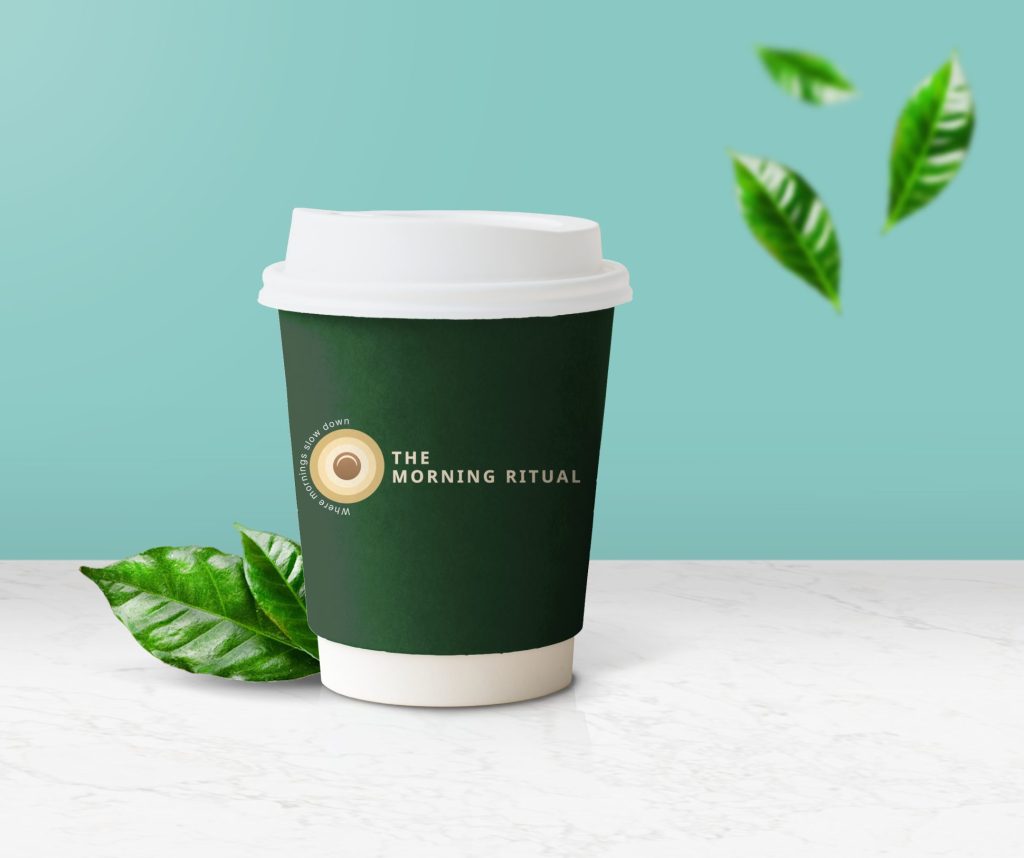
Home > Page Title The Morning Ritual – Café & Hospitality Designing a warm cafe identity inspired by rituals and community. Creating a brand that blends artisanal coffee culture with the calm ritual of mornings, through elegant design, cohesive branding, and engaging digital presence. Client The Morning Ritual Industry Cafre & Hospitality Category Branding Location Pune Project Brief The Morning Ritual café wanted a brand that reflected the mindfulness of early mornings while standing apart from typical coffee chains. Their goal was to build a calm and artisanal identity rooted in ritual and belonging across physical and digital touchpoints. The Challenge Most cafés relied on aesthetic alone. The Morning Ritual needed to express emotional warmth, ritual, and consistency without losing brand distinction. Our Approach Research Analysed artisanal café patterns and consumer rituals around mornings to extract emotional anchors like warmth, calm, and habit. Strategy Built a narrative around ‘morning as ritual’ using soft symbolism (rising sun), earthy tones, and physical consistency. Execution Created a full brand kit: logo, packaging, loyalty touchpoints, and social media tools all rooted in a consistent mood and tone. The Outcome The café became an emotional brand. From store signage to stories online, every interaction feels intentional, drawing in a loyal, mindful community. Enhanced walk-in attraction through bold café signage Cohesive branding across digital and physical touchpoints A strong community-driven identity that connects emotionally with customers The applications extended across multiple brand touchpoints, including packaging with custom-branded coffee cups, sleeves, and takeaway bags, as well as collateral such as café standees, menu boards, and loyalty cards. On social media, we designed aesthetic grid layouts that combined storytelling with promotional offers, creating a cohesive and engaging brand experience both online and offline. Let's craft what's next