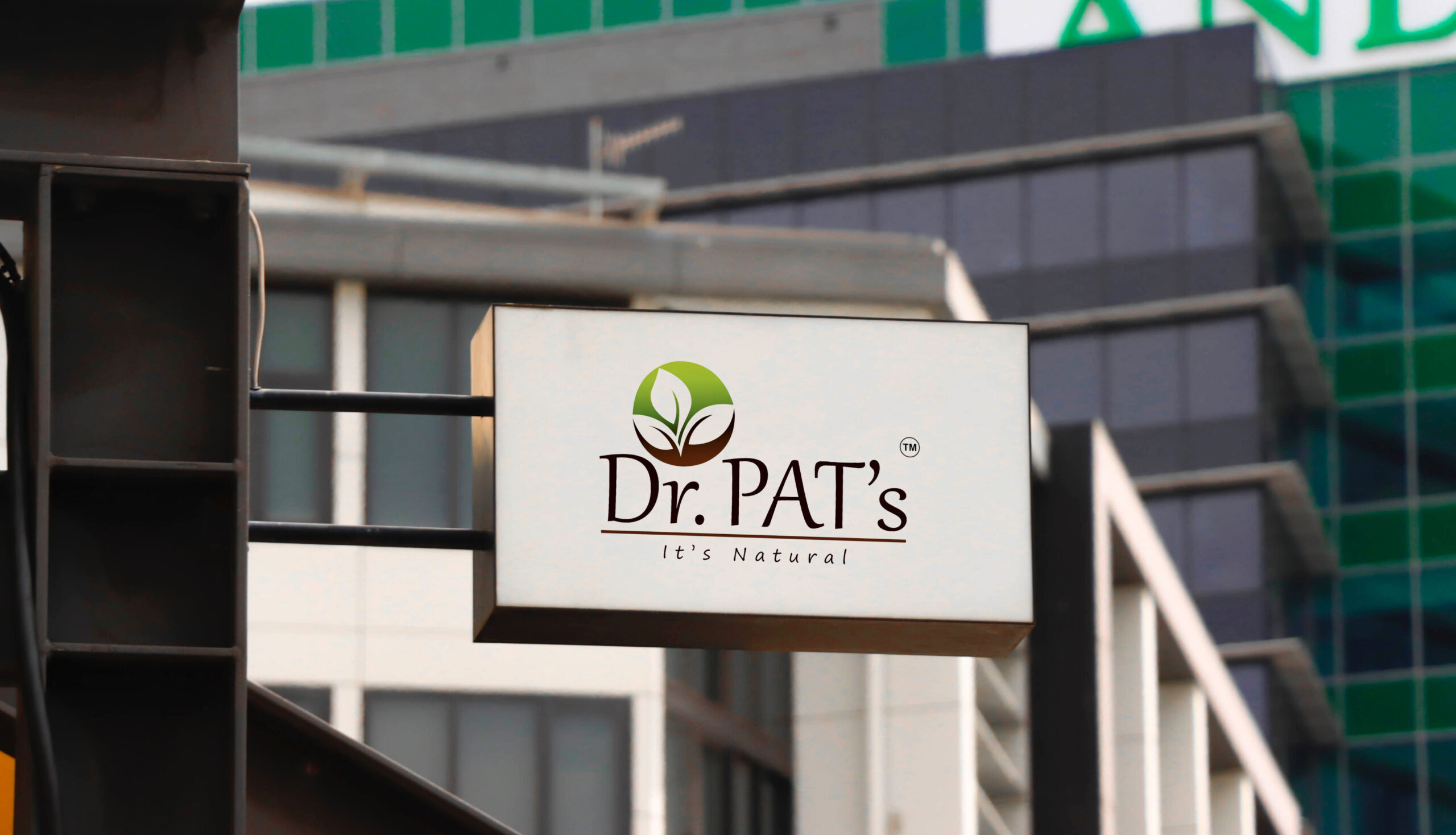
Dr. Pat’s needed a clean, earthy visual identity to reflect their commitment to natural skincare. They wanted a premium design language for their logo, packaging, and digital presence that would communicate purity, quiet luxury, and sustainability..
Dr. Pat’s lacked a cohesive design system. The brand needed to speak to eco-conscious buyers with a modern, nature-rooted identity across touch points.
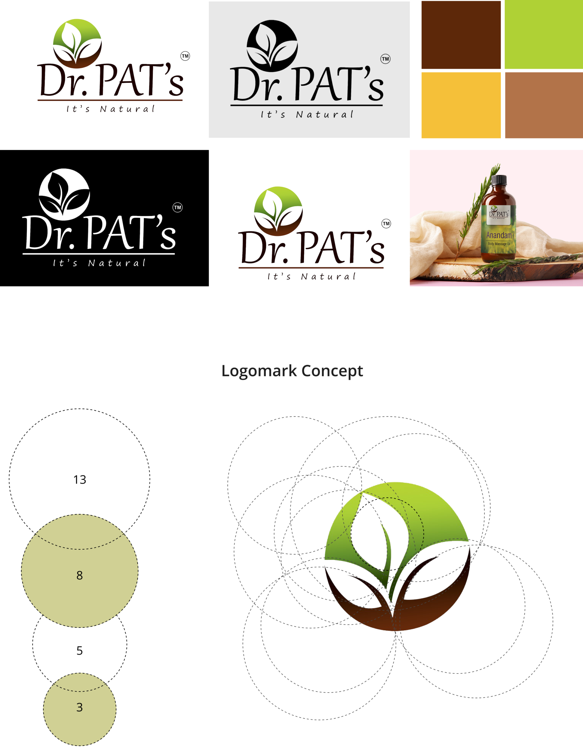
The client provided their brand values, philosophy, and product range, with emphasis on natural formulations and sustainable practices. They were tasked with designing a logo, packaging, and identity system that captured the essence of pure skincare rooted in nature.
Visual Design
Visual design focuses on aesthetics, color, layout, and imagery. It enhances usability, builds trust, and creates an emotional connection, making the experience more engaging, appealing, and memorable for users.
Outcome
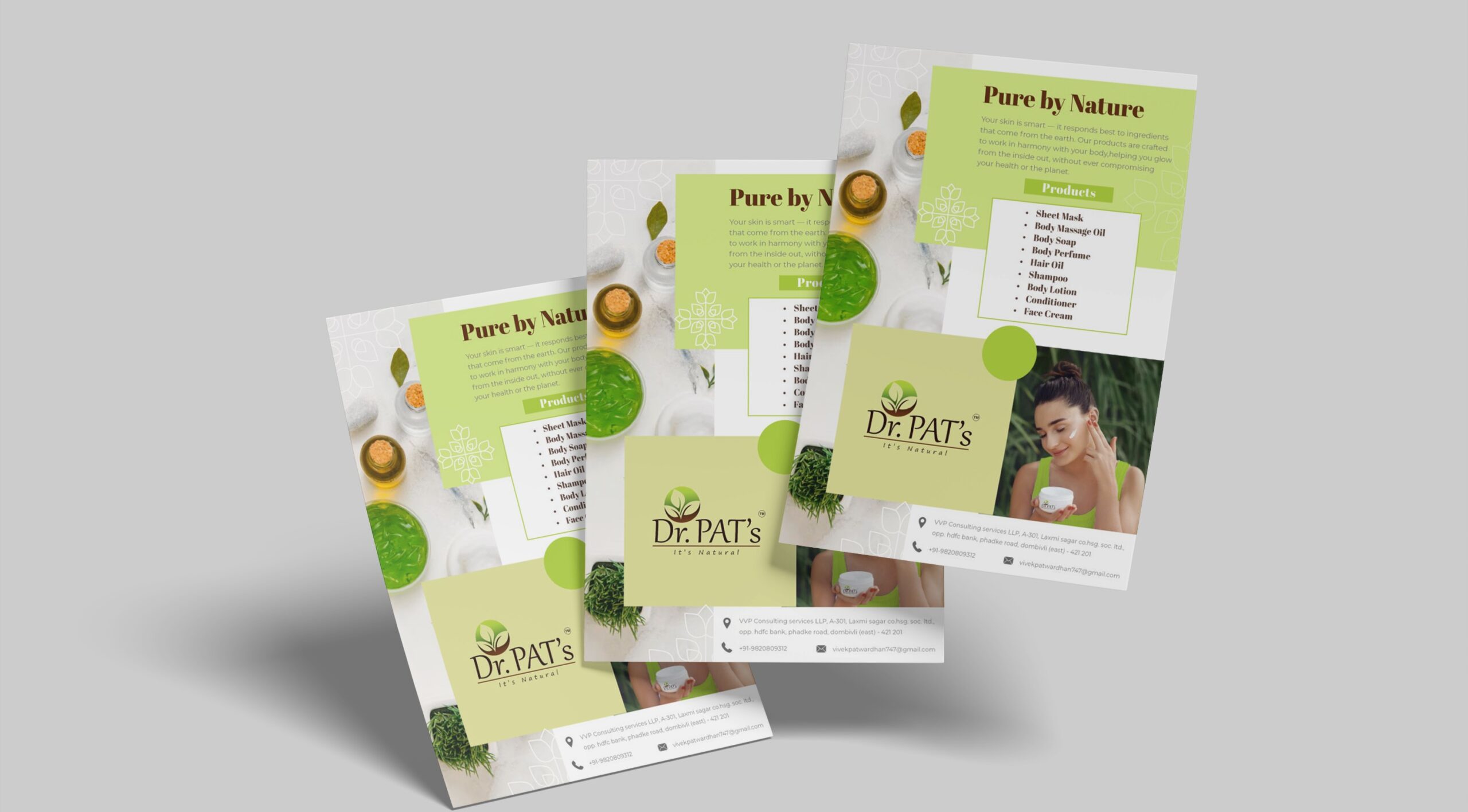
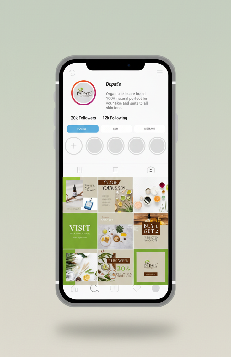
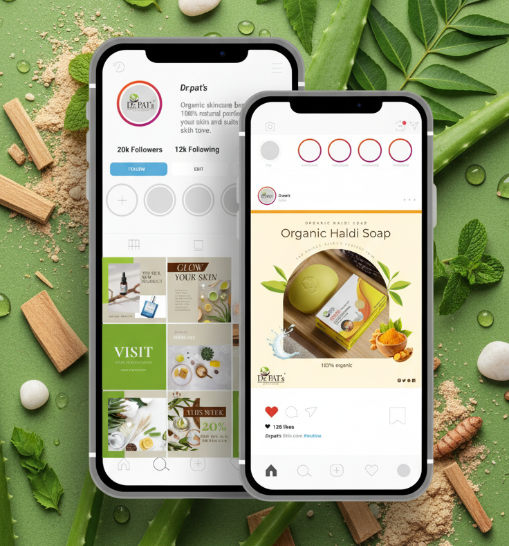
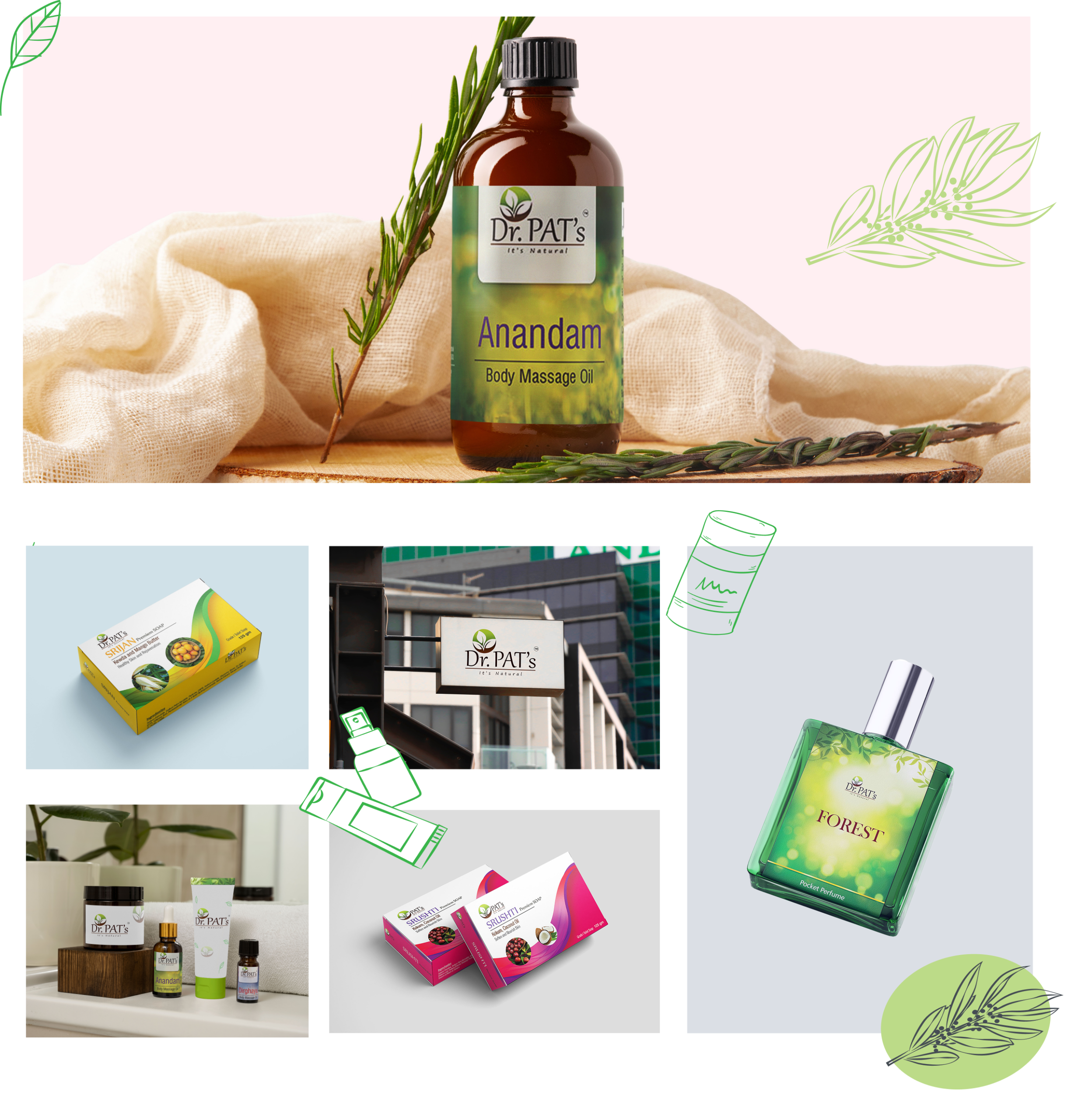
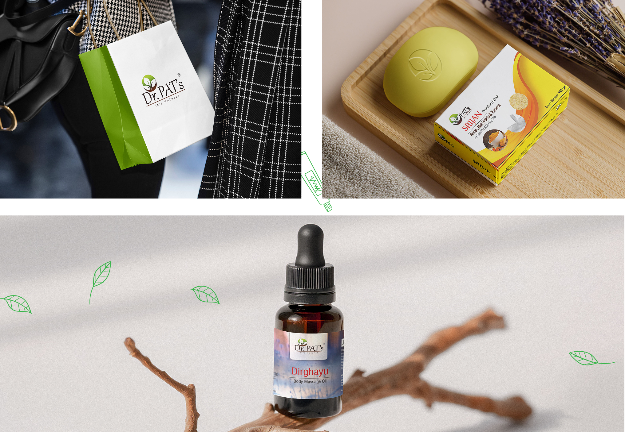
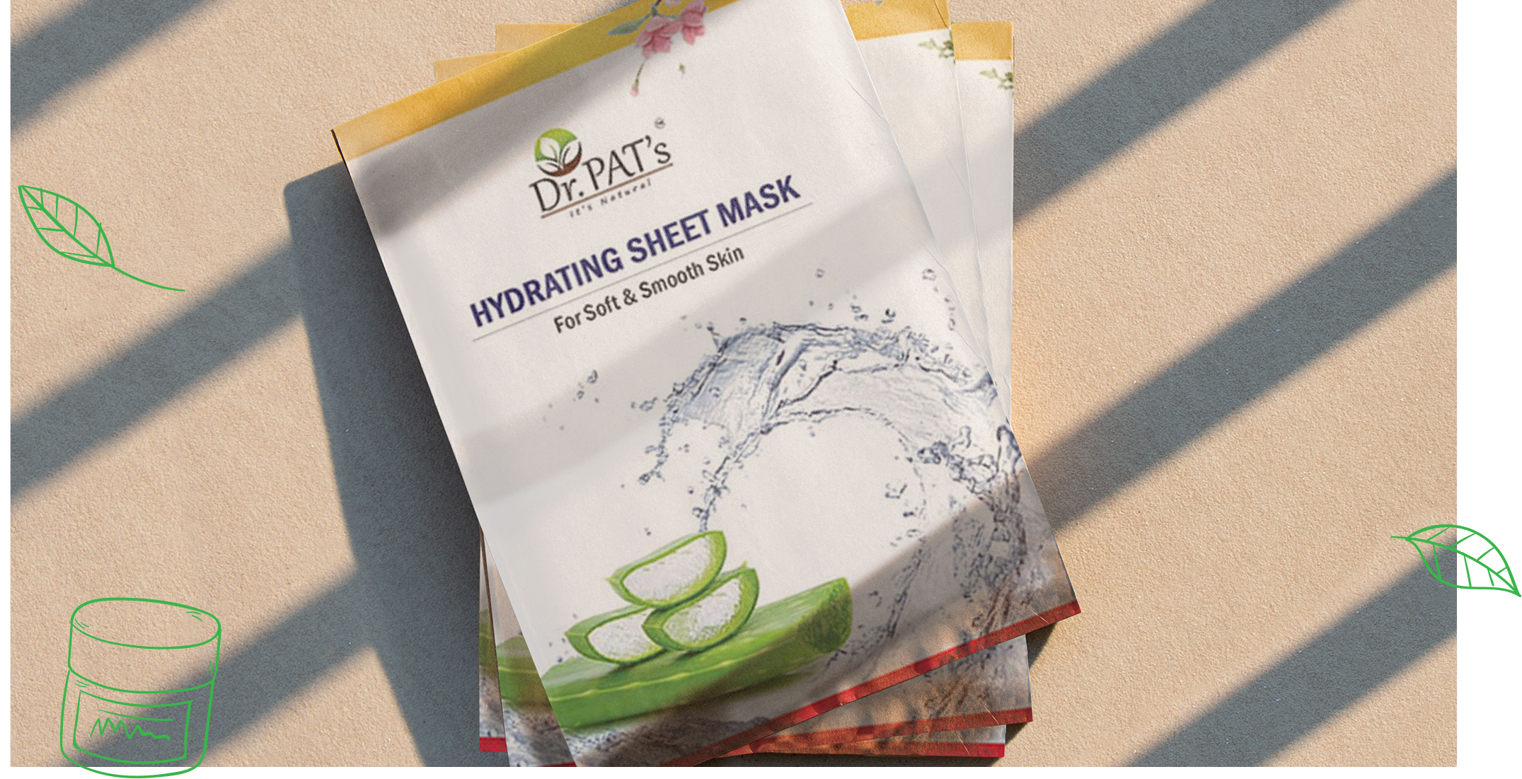
I designed a hand-crafted, organic-inspired logo that embodies authenticity and connection to nature. Alongside this, I built a soft, earthy visual palette with minimal typography and natural textures to strengthen brand recognition. Packaging and collaterals reflected purity, quiet luxury, and holistic beauty, resulting in a consistent and premium identity across digital and physical platforms.
Outcome
Dr. Pat’s brand now speaks the language of modern purity. Design aligns with its clean design philosophy across all mediums.